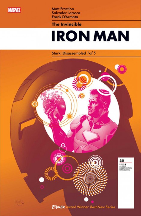
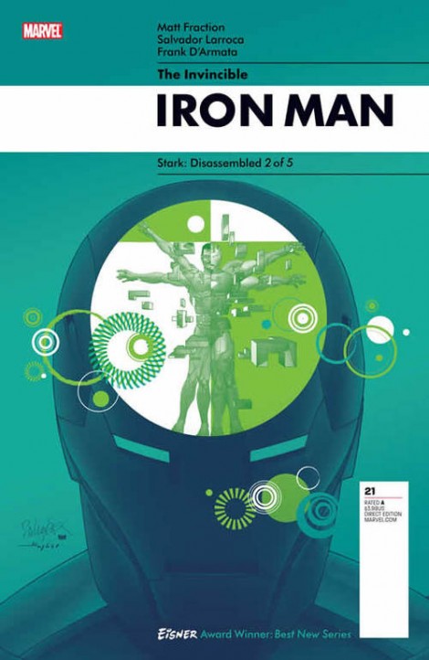
 As much as we used to get chromium, hologram & diecut varieties of comic book covers, the basic design of a cover of a comic book has used the same M.O. since the inception of the medium: a title over illustration. Sure, some other design trends have slipped in here in there (who can forget Jim Steranko’s iconic covers) every once in a while but for the most part, same shit. Well with the wrap up of a year long story arc on the Iron Man book, Marvel has called on for an entirely new take on what a comic book cover should look like and they’re recruited Rian Hughes (formerly of the design collective known as MK12) to the redesign and all I can say is that it’s pretty stunning. The redesign starts with issue #20 and I have yet to see how long it will stick but the sexy look is full of WIN in my book. Check out the cover for issue #21 after the break and let us know what you think: Could all of Marvel’s line of book follow suit or does this look only work well with the tech-based Iron Man book?
they look nice, ok i guess, but its different, i dont know if its different in a good way though. plus i dont think it will catch on. i do believe DC will come out with their own "new" cover layout because they're always stealing Marvel's ideas. i think it will be hard to do a "fight" issue cover that doesnt take roots in the more conventional cover style. the covers are very lack luster and dont really convey any action that might be happening within the pages of the book. the covers look like they go on a regular novel cover then a comic book cover, my 2 cents.
I like em. They remind me of 60's Disneyland posters.
When does issue 20 come out? (I haven't been to Dave's lately).
Actually not sure when it's due out but I think it's either Nov. or Dec. And you need to visit Heroes and maintain your nerd card.
Actually DC already did this 2 years ago…